Brand
The colors, type, and pieces this site is built from. Every value here is pulled from the live stylesheet, so this page changes when the site does.
Color
Warm grays on a warm off-white page, with one teal for the accent and keyboard focus. Dark mode inverts the same grays onto a near-black page. Each swatch shows the value and contrast against the page for the active theme (the nav's theme button switches it). Text needs at least 4.5:1.
-
--paper#f5f2ec 1.0:1 #1a1816 1.0:1 -
--ink#1c1917 15.7:1 #f2efe9 15.4:1 -
--muted#68635d 5.3:1 #a8a299 7.0:1 -
--body-ink#383531 10.9:1 #dcd7cf 12.4:1 -
--muted-soft#6f6a63 4.8:1 #9a948b 5.9:1 -
--rule#d6d0c7 1.4:1 #403b35 1.6:1 -
--section-rule#e4dfd7 1.2:1 #2e2a26 1.2:1 -
--accent#0589a9 3.6:1 #4cc3e0 8.6:1 -
--selection#ccebf2 1.1:1 #134b5c 1.8:1 -
--code-surface#ece8e1 1.1:1 #26231f 1.1:1 -
--hover-surface#ede9e2 1.1:1 #24211e 1.1:1 -
--card-surface#ece8e1 1.1:1 #27241f 1.1:1 -
--card-surface-hover#e3ded5 1.2:1 #322e29 1.3:1 -
--scrollbar-thumb#aaa49c 2.2:1 #5a544c 2.4:1 -
--portrait-shadow#1c1917 15.7:1 #34302b 1.4:1
Type
Geist for text and JetBrains Mono for code, both self-hosted, in seven sizes. The hero, display, section and heading sizes are set at weight 600 and everything else at 400.
--font-size-hero 32–40px · 600
Make the technology useful
--font-size-display 32px · 600
Make the technology useful
--font-size-section 24px · 600
Make the technology useful
--font-size-heading 20px · 600
Make the technology useful
--font-size-title 17px · 400
Make the technology useful
--font-size-body 15px · 400
Make the technology useful
--font-size-meta 12px · 400
Make the technology useful
-
--body-font'Geist Variable', Arial, Helvetica, sans-serif -
--title-fontvar(--body-font) -
--mono-font'JetBrains Mono Variable', 'JetBrains Mono', ui-monospace, SFMono-Regular, Menlo, Monaco, Consolas, monospace
Layout
Every page is one centered column. Each band (hero, sections, footer) is capped at
--content-max and padded by --page-pad on each side, so all the
left edges line up. The padding shrinks on phones. This page adds a sticky section list
in a left rail, which no other page has.
-
--content-max61.5rem -
--page-pad3rem
Links & focus
Links in text keep a thin underline, like this one. Press Tab to see the teal focus ring.
Dividers
A short dotted line opens each home section and the footer, and a short centered one closes article headers. The only full-width dotted line is between rows in a list.
Lists
Projects and posts are one row per link: name, description, then the date, with pixel dots between rows. Rows have no hover state beyond the screenshot preview.
Cards
Cards are only used on Inspo, for other people's work. The card grows with what it holds: a label, then any image, excerpt, title, source, and note. Quotes lead with the line itself.
It always bothered me that, as toys, Transformers were clearly compromised in both states.
 Website ideas
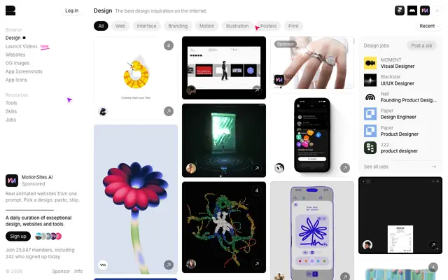
The best design inspiration on the Internet.Recent
 HelloGov AI-powered passport, visa, and vehicle registration applications.
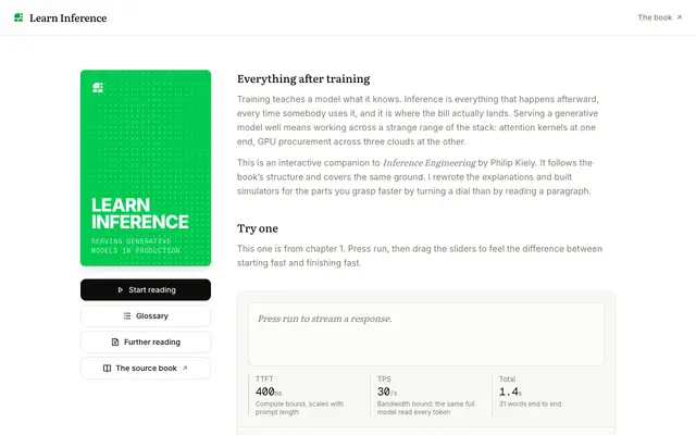
An interactive guide to serving generative models in production.Learn Inference Companion to Inference Engineering by Philip Kiely.
I just found out the GPT in ChatGPT stands for Gomputer Pomputer TomputerGomputer Pomputer Tomputer
 Helping agents create things worth making The Brand API section.
I know very little about anything, but I do know this: if you can live your life without an audience, you should do it.
Pixel art
Icons and cursors are drawn on a pixel grid and kept square. The dotted dividers use the same 2px squares.
Social icons
16 × 16, one color. Kept for reference; the site links to these profiles with text.
- X
- GitHub
Inspo types
8 × 8, beside each label on cards and filters.
- All
- Quotes
- Patterns
- Tweets
- Articles
- Books
- Sites
- Products
- Videos
Favicon
The nav teacup on a transparent 16 × 16 grid.
-
 Cup
Cursors
Hover the links on this page to try them. Hold Cmd over a link for the new-tab cursor.
- Default
- Link
- Leaves the site
- New tab
Photo
The portrait from the home page, full size, for talks, bios, and anything else that needs a photo.

Link previews
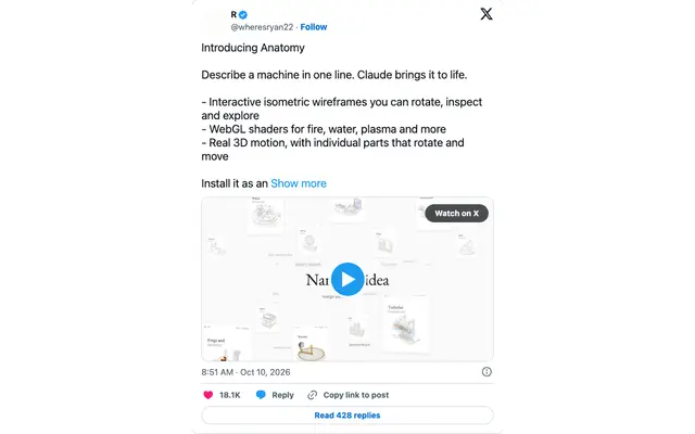
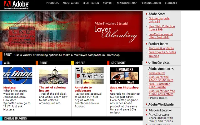
Every external link on the site has a screenshot, taken once. Links that opt in show it beside the cursor: the project list, the intro, and blog posts. Hover Parcel to try it.
81 captured, 2 without a preview
-
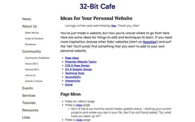 32bit.cafe
-
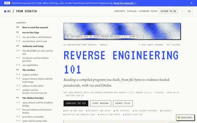 aiengineeringfromscratch.com
-
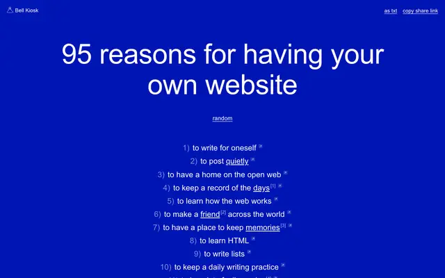 bellkiosk.website
-
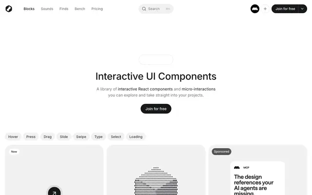 bencho.dev
-
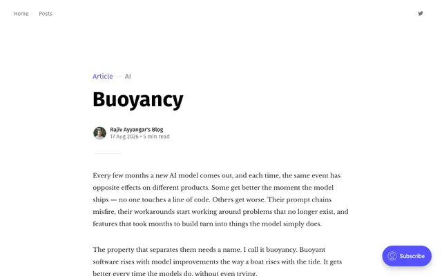 blog.rajivayyangar.com
-
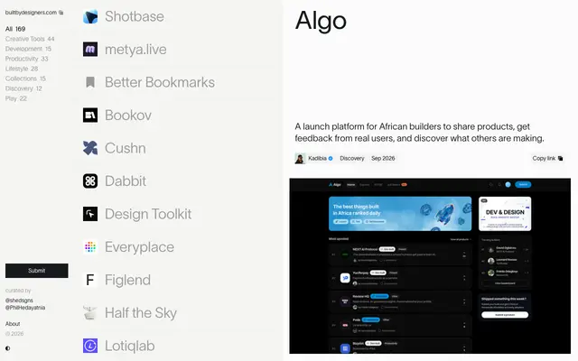 builtbydesigners.com
-
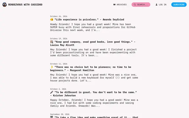 buttondown.com
-
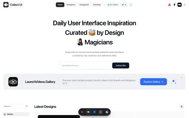 collectui.com
-
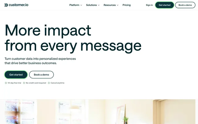 customer.io
-
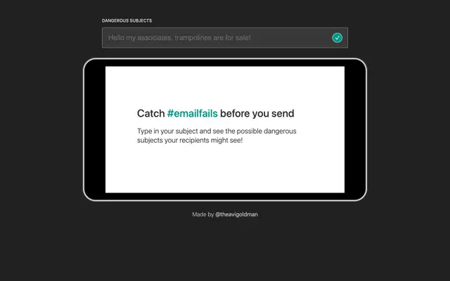 dangerous-subjects.avigoldman.com
-
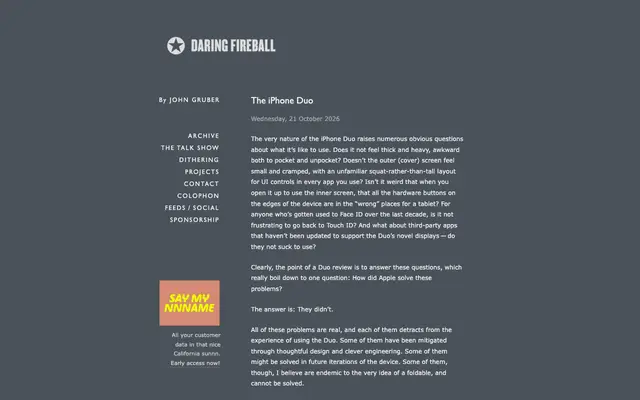 daringfireball.net
-
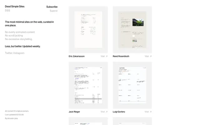 deadsimplesites.com
-
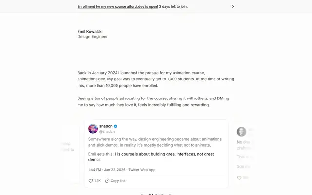 emilkowal.ski
-
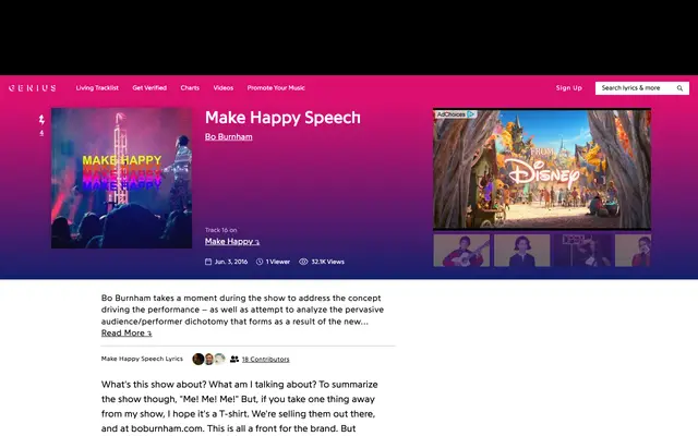 genius.com
-
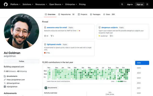 github.com
-
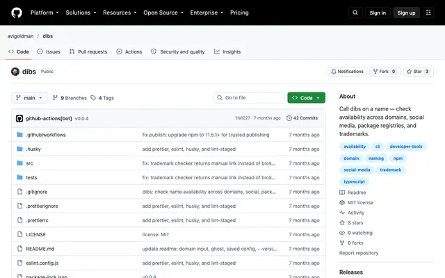 github.com
-
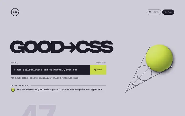 good-css.com
-
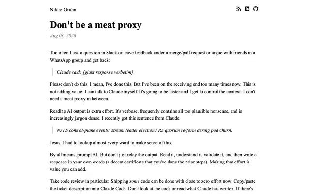 gruhn.me
-
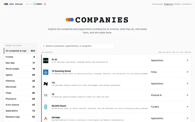 intelligence.mts.now
-
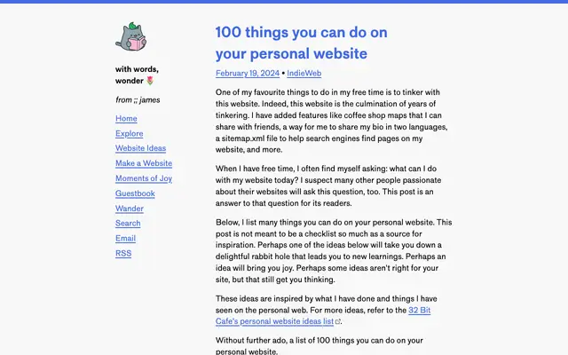 jamesg.blog
-
 justin.poehnelt.com
-
 learn-inference.com
-
 leerob.com
-
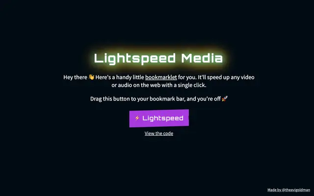 lightspeed-media.avigoldman.com
-
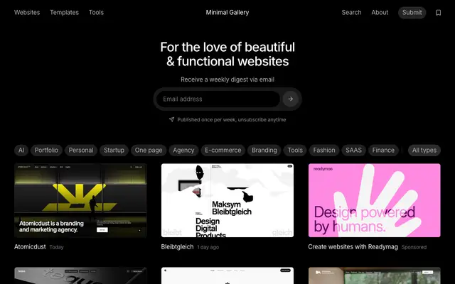 minimal.gallery
-
 movin.design
-
 parcel.io
-
 patrickcollison.com
-
 professometer.com
-
 realfunwow.com
-
 recent.design
-
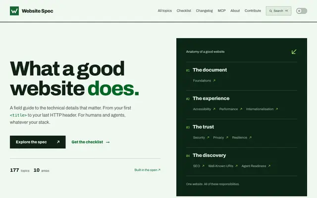 specification.website
-
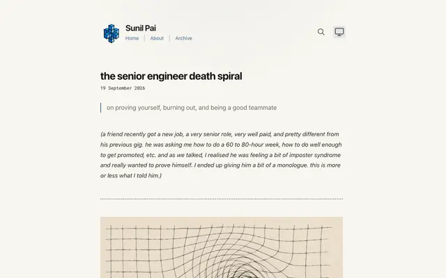 sunilpai.dev
-
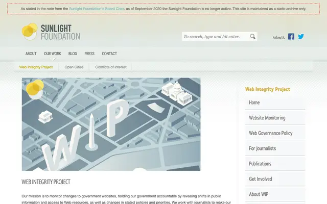 sunlightfoundation.com
-
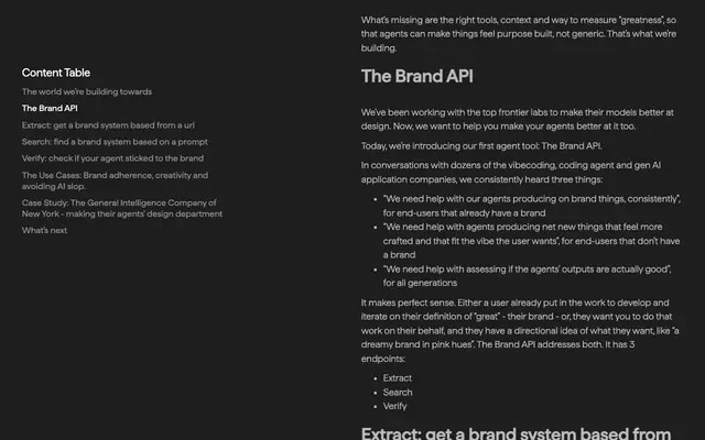 tastelabs.com
-
 thegovlab.org
-
 thinkingmachines.ai
-
 tools.simonwillison.net
-
 transitions.dev
-
 trevinsays.com
-
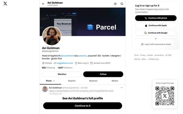 twitter.com
-
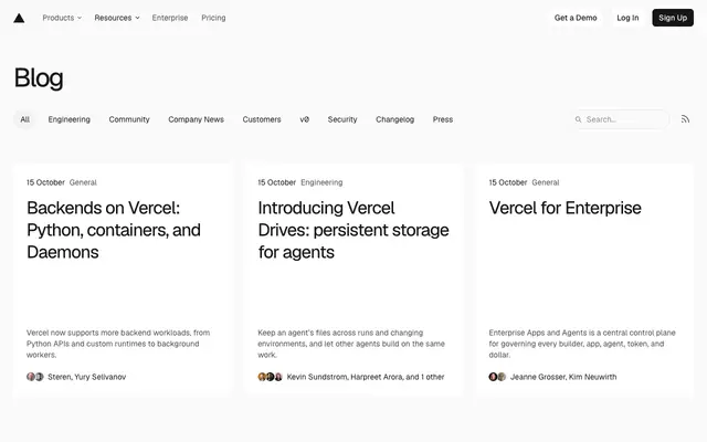 vercel.com
-
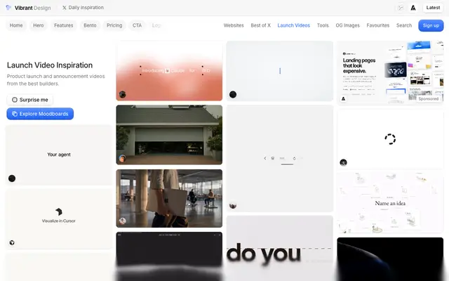 vibrant.design
-
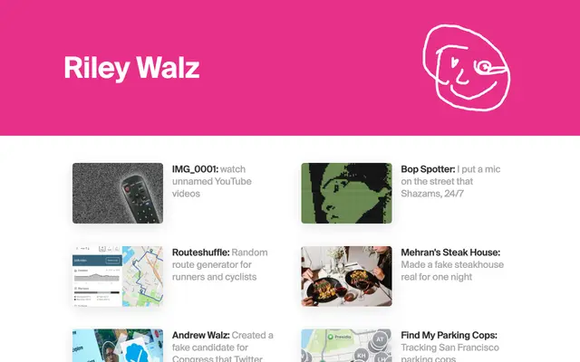 walzr.com
-
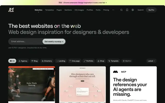 a1.gallery
-
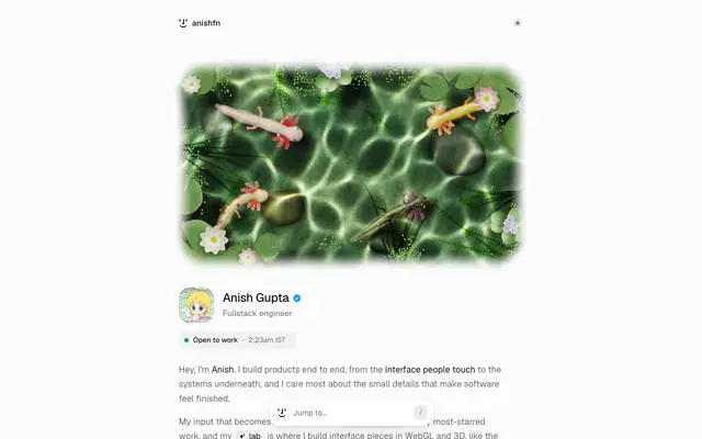 anishfn.ink
-
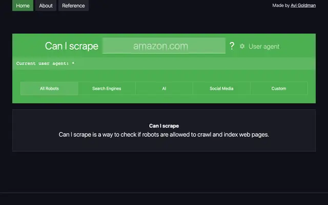 caniscrape.com
-
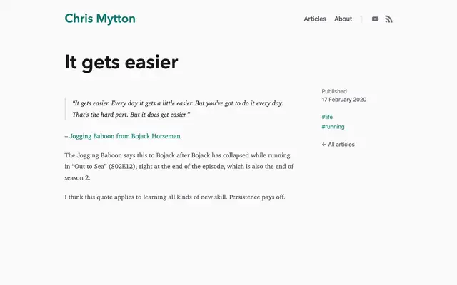 chrismytton.com
-
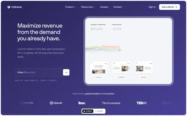 coframe.com
-
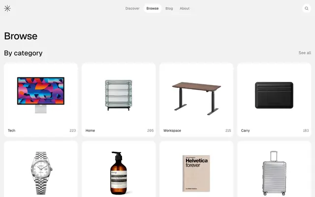 curated.supply
-
 danielwhite.uk
-
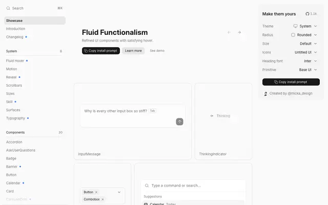 fluidfunctionalism.com
-
 hellogov.com
-
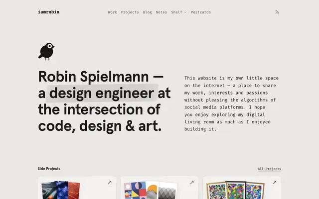 iamrob.in
-
 instagram.com
-
 instagram.com
-
 instagram.com
-
 instagram.com
-
 instagram.com
-
 instagram.com
-
 makingsoftware.com
-
 opendataenterprise.org
-
 workingtheorys.com
-
 x.com
-
 x.com
-
 x.com
-
 x.com
-
 x.com
-
 x.com
-
 x.com
-
 x.com
-
 x.com
-
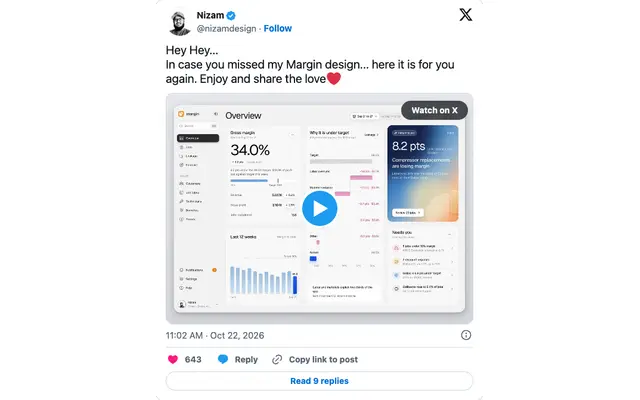 x.com
-
 x.com
-
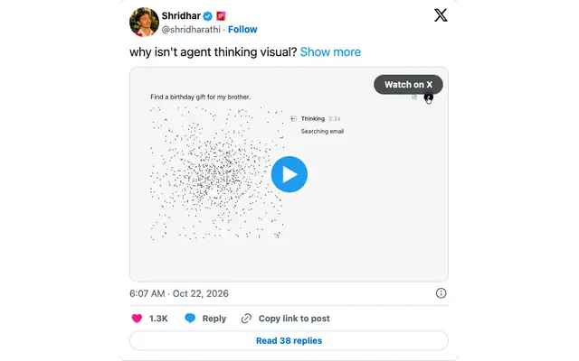 x.com
-
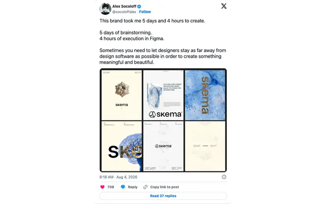 x.com
-
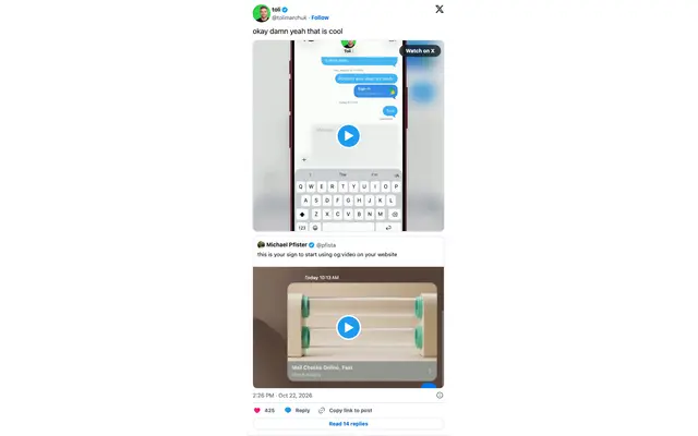 x.com
-
 x.com
-
 x.com
-
 zeldman.com
-
 zoah.com
- internetlabs.co/ popup or overlay
- linkedin.com/in/avigoldman/ HTTP 999
Social
Profile covers for LinkedIn and X: the teal pixel cursor at about real-cursor size, its tip 20% from the left and 40% from the bottom, and the pixel teacup, small, sitting on the bottom edge near the right. Run
pnpm coversto redraw them after the colors change.